Swell’s Scalable Design System
Swell is a creative agency striving to solve the big problems vexing our world—from homelessness, to climate change, to political inaction, and everything in between. They needed a design system that could be as nimble as it is robust, and impactful no matter the budget of our non-profit clients.

A component library for compassionate change
Our clients rely on us to create meaningful brands, campaigns, and actions for those most in need. Far from a one-size-fits-all solution, this design system is a starting point for design and dev teams to get from massive social problem, to a conscientious and custom solution. When the nuts and bolts are already figured out, innovative thinking can confidently thrive.
01—The System
Creatively flexible, technically rigorous
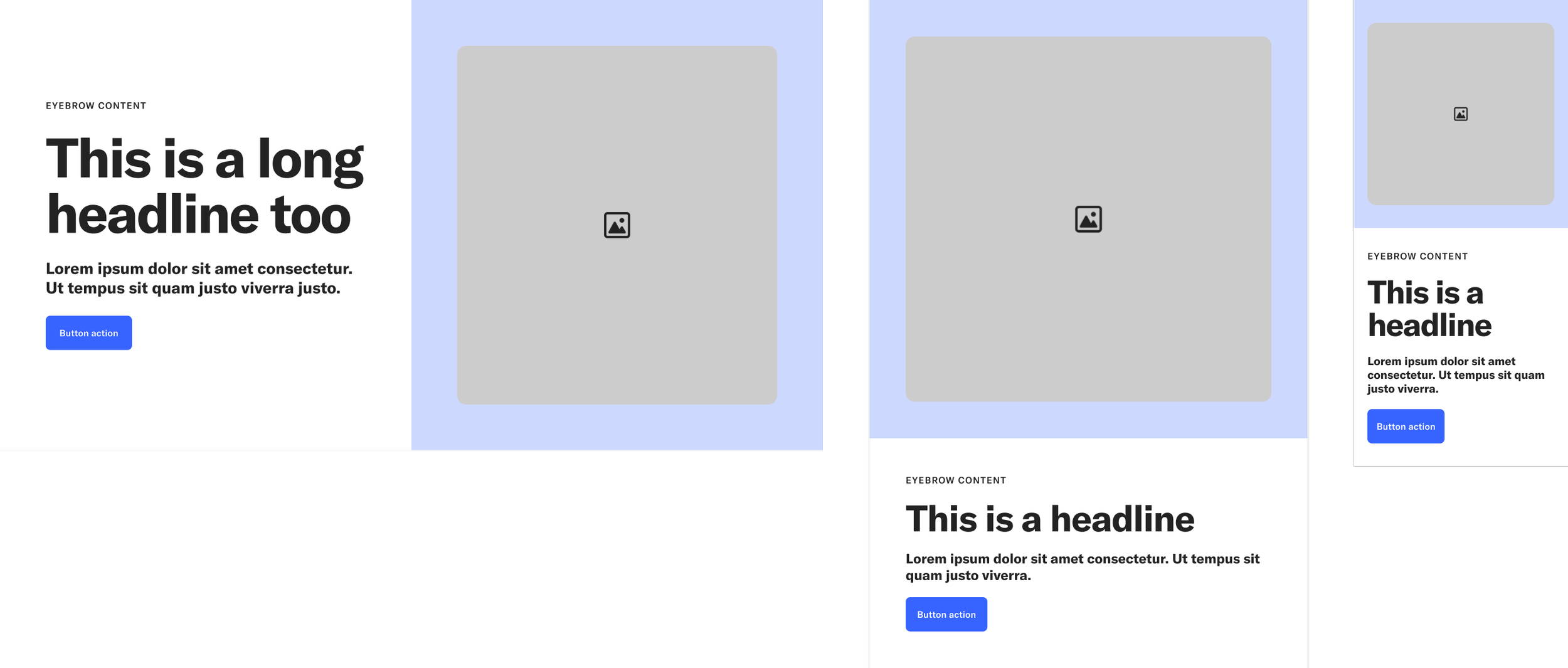
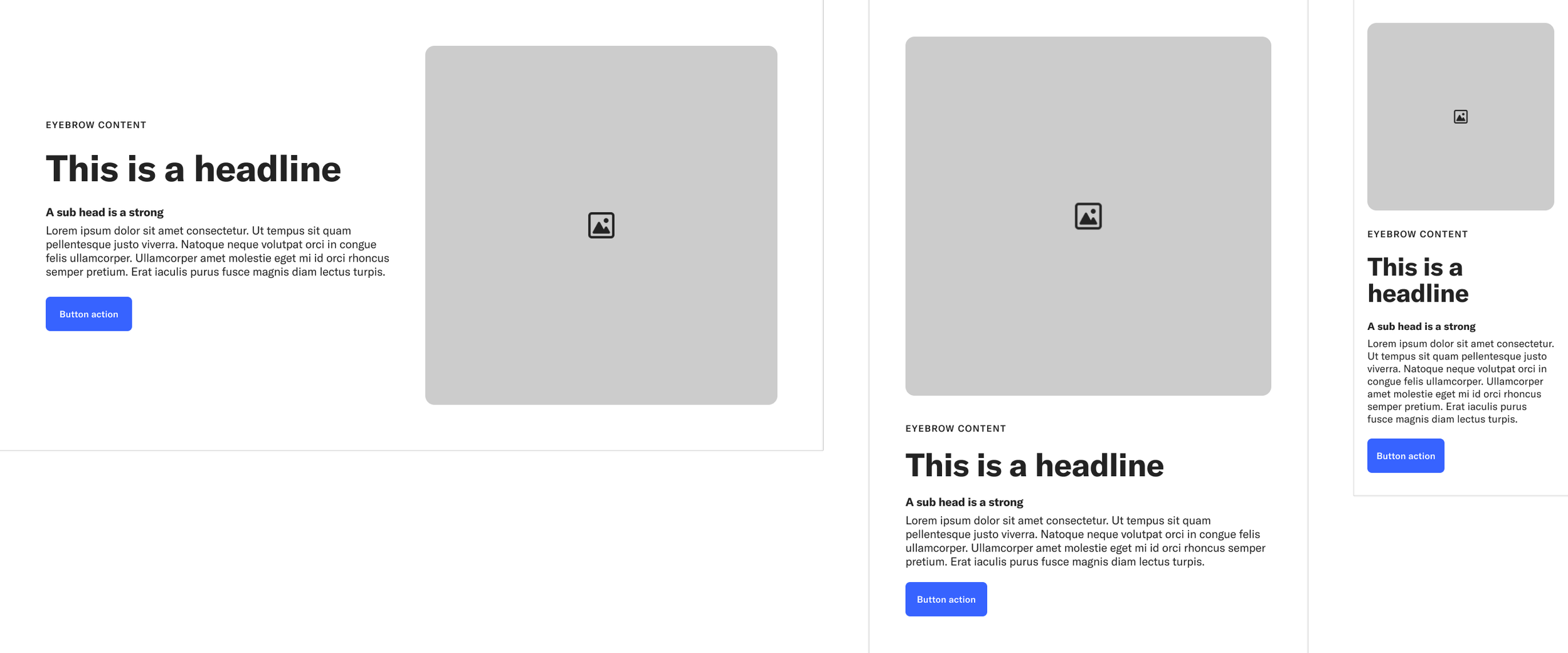
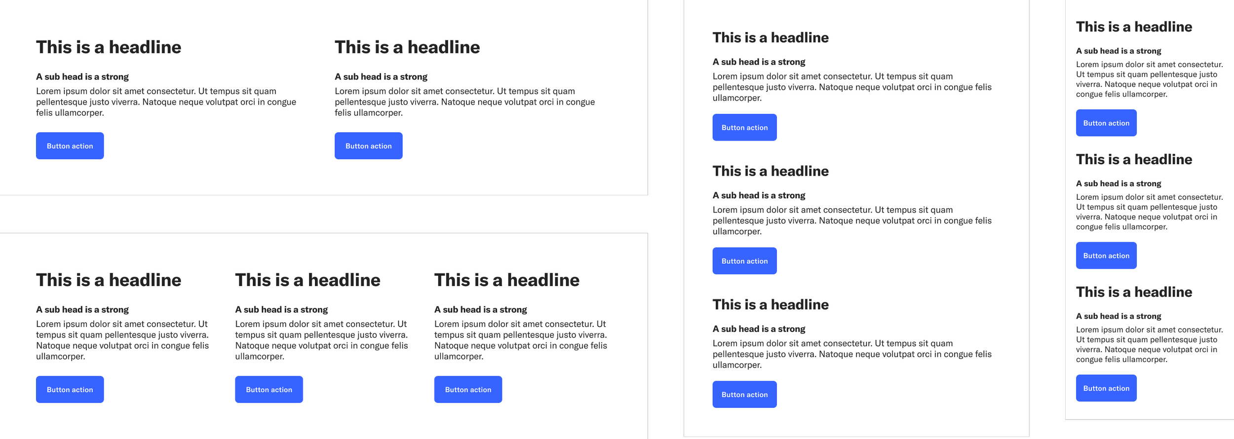
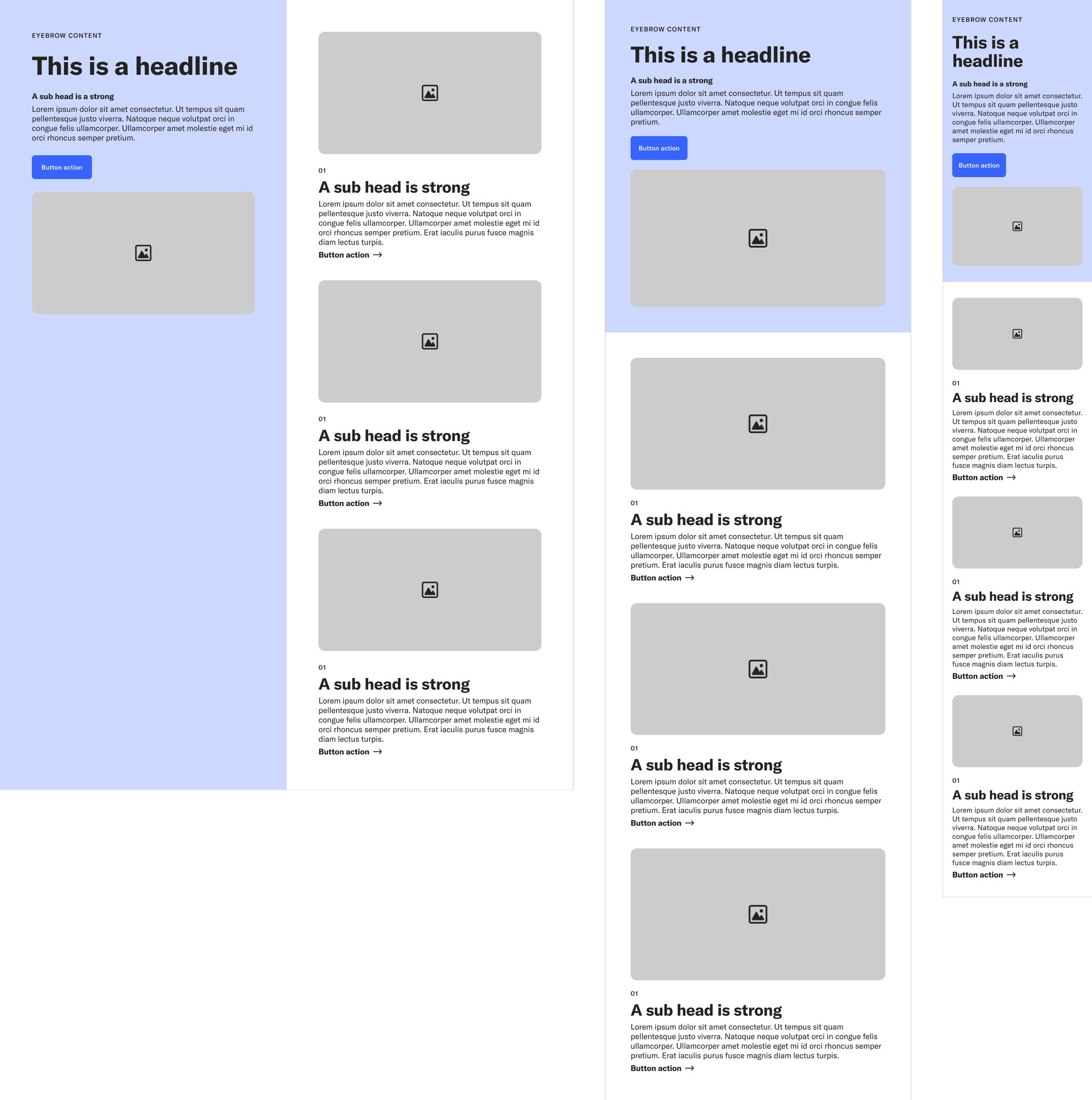
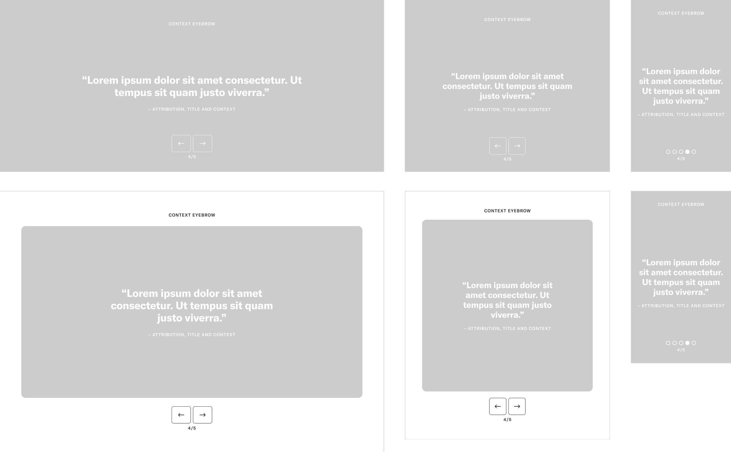
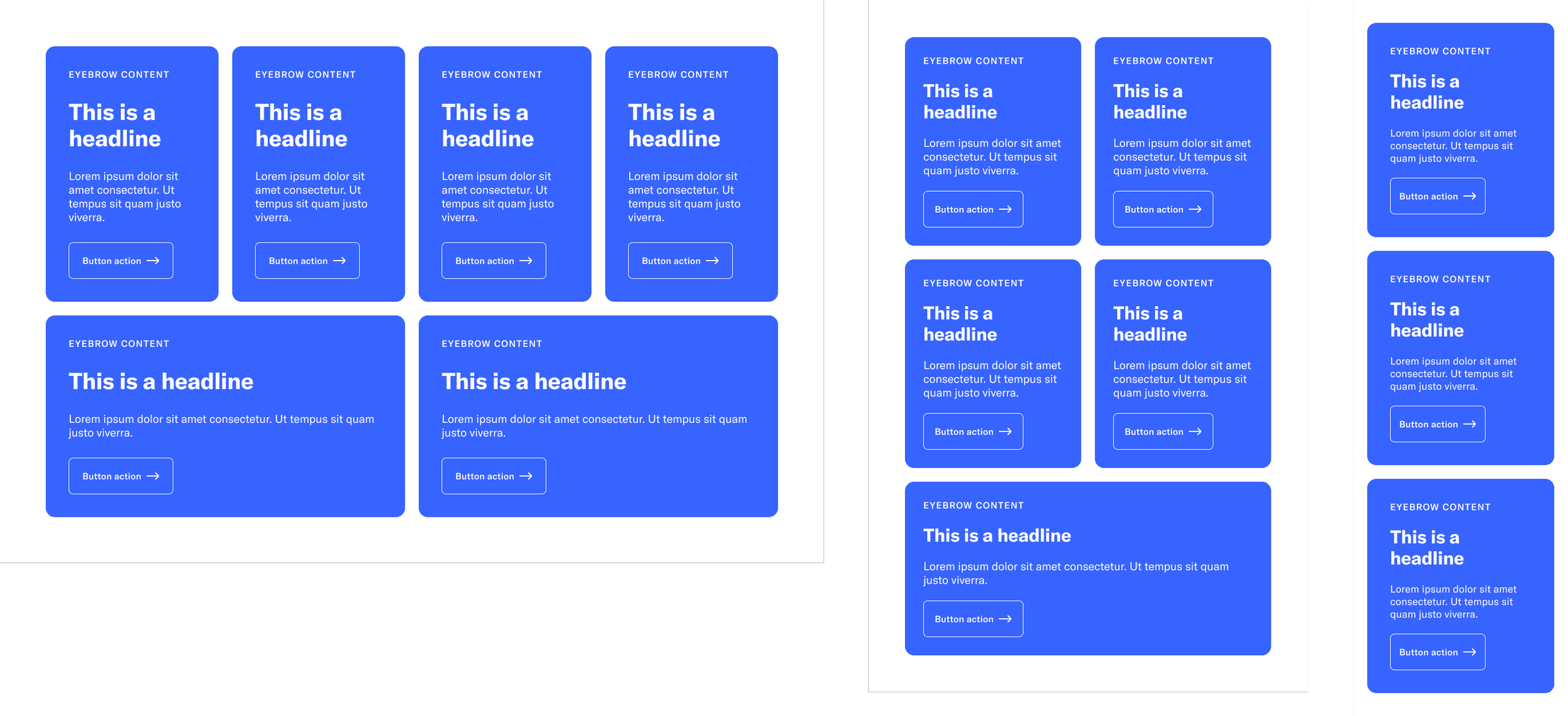
Rules are made to be broken—but you damn well better know the rules before trying to innovate on them. That’s why we created a modular system with rigorously designed and coded constraints that define the sandbox users get to play in without limiting the possibilities available to our clients. Using the components as a starting point, we can be sure our end result is programmatically sound, fully responsive, and ready for public scrutiny.
Distinct modules, endless possibilities.
Once the elements were defined and their relationships fine-tuned, the components could be stylized to each clients needs—without sacrificing the fidelity of the final coded output.
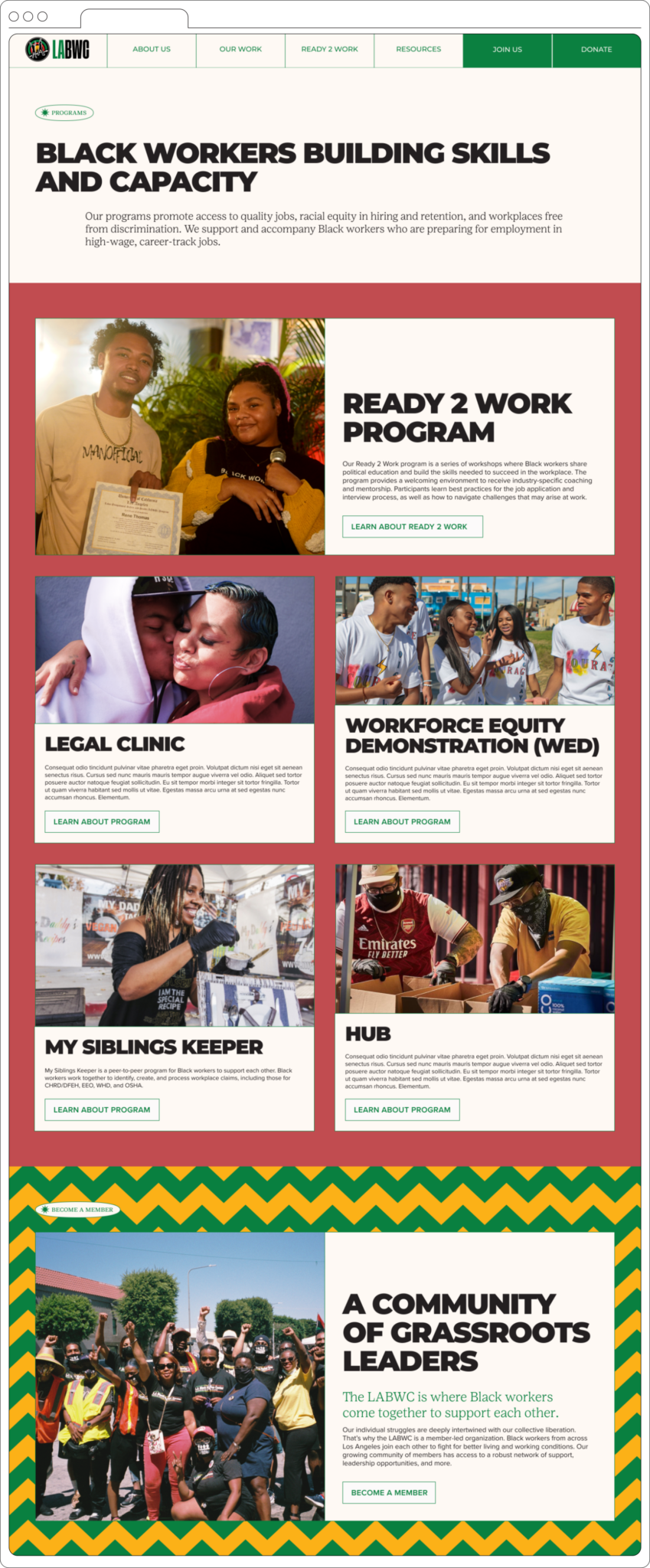
These are a small selections of the pages that used the initial instance of the module library. With confidence in the underlying system, the teams could focus on what made the greatest impact for end users.
The system in practice
03—The components
Anticipating client needs
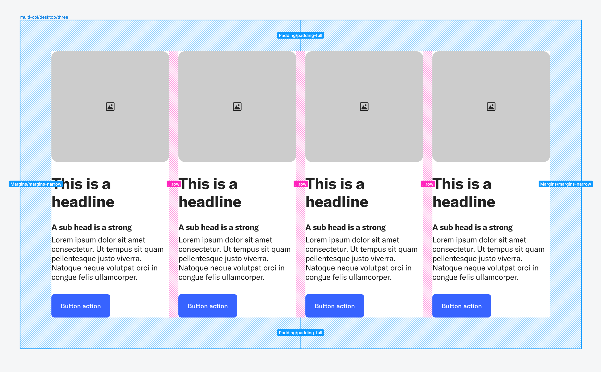
At 27 modules and counting, the Swell Design System is an ever-evolving tool that looks to imagine client needs before they become urgent. We’ve front-loaded the technical work, so designers, content creators, strategists and clients and dream freely and produce confidently.
Mobile first, responsive always
No matter the user, no matter the device, we created a system that adapted to each individual’s needs. With the new features released at Config 2023, we could make our design files reflect the responsiveness that our code always held.
Toiled-over details
With a basic atomic system at it’s heart, we made sure each element was considered and reconsidered. When it came time to implement a site, designers knew they could focus on what matters—making a difference for our clients.

03—The documentation
Engineer whispering
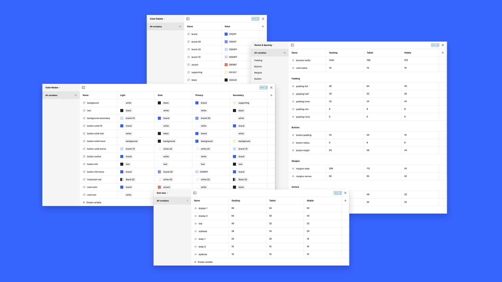
Taking advantage of the newest releases from Figma—universal variables, tokens, and dev mode—we’ve overhauled the system to talk to developers like… well, developers. What used to be a process wrought with sidecar documentation and exhaustive handoff conversations, is now made frictionless as designers and engineers speak the same language.

The addition of variables to Figma fundamentally changed the workflow of designers and developers in the process of building new sites. Now, with the change of a single cell designers can cascade changes across the entire system, and developers are notified of everywhere their code needs to change. Gone is guesswork and tedious QA.

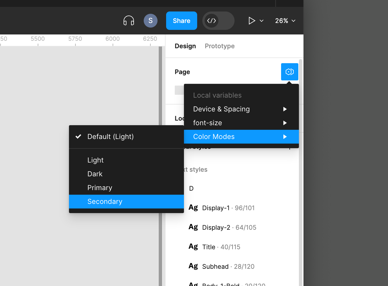
As part of our baseline system we account for things like color modes, device and browser sizes, and contextual flow. All of which can be changed at the stroke of a key—in an individual component instance, or universally across your designs.
One-click color modes (and more)

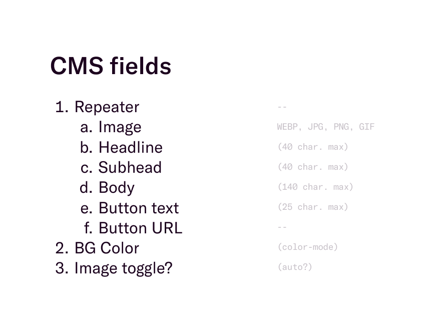
Authors are users too
Of course end-users are at the center of every decision we make, but our direct clients are the folks tinkering in the CMS. As a standard part of every delivery, we work with strategists and content creators to understand the client capabilities, and cater a backend experience to arm them for success.
04—The Impact
Constraints breed creativity
By putting so much careful consideration into a scalable design system—outside of a particular client deliverable—we’ve freed designers and developers up to explore, experiment, and break things. Additionally, site designs come to high-res faster, site development is functional out of the gate, and QA is much less like pulling teeth.
The team
Work created while at Swell Inc
Creative direction
Christian Gilbert
Greg Hubacek
Design
Christian Gilbert
Olivia Taylor
Josie Allison
Development
Andres Cruz
Tommaso Boggia
Andrew Garcia


